In a nutshell
- 🟠 Amber hues sit between yellow and orange, delivering warm, low-arousal light cues that lower stress, boost sociability, and tap positive, harvest-linked memories, according to colour psychologists.
- 🏡 Use amber to shape behaviour: layer tactile accents (suede, smoked glass) for cosy zones, keep bold notes as focal points, and balance with breathable neutrals plus a single cool counterpoint to avoid heaviness.
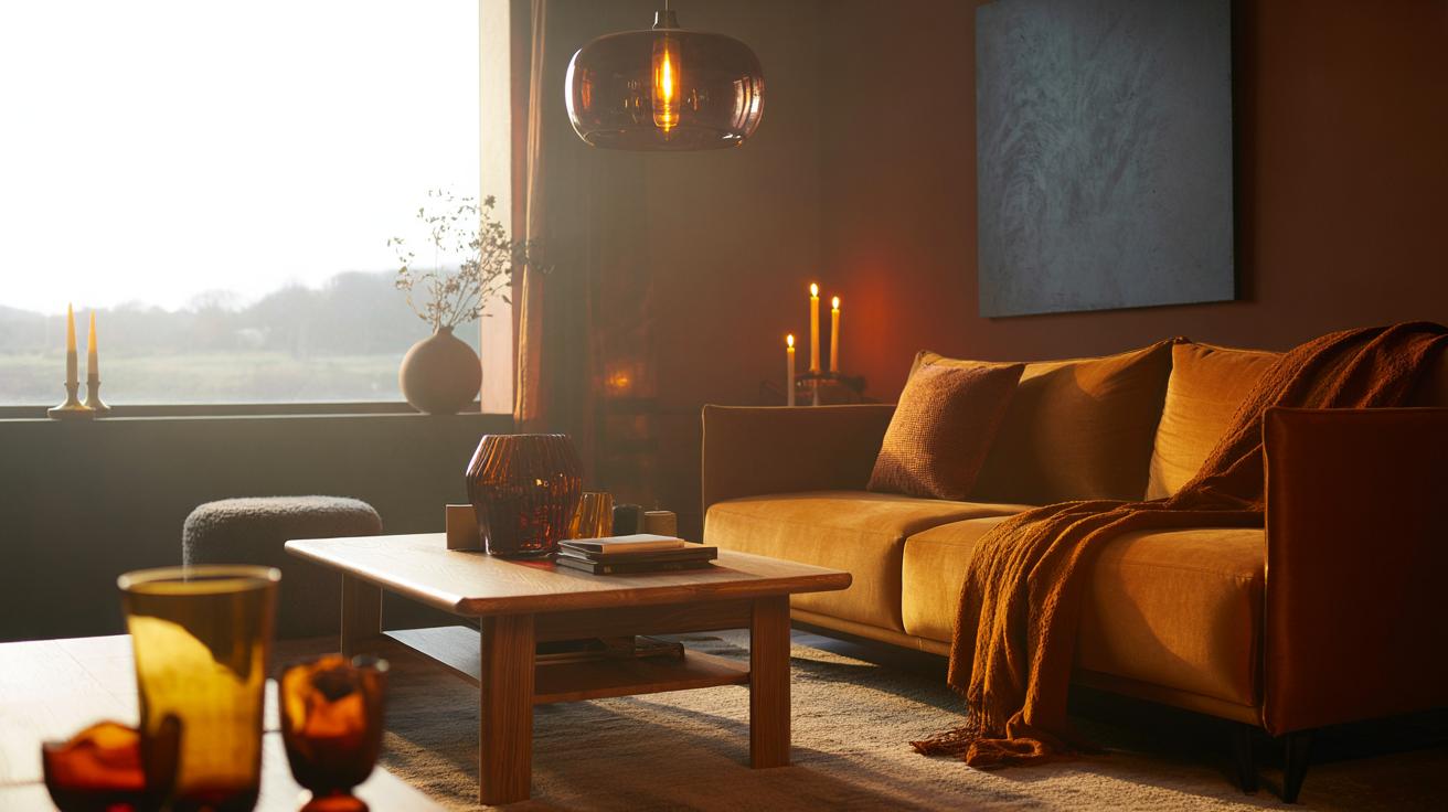
- 📋 Room-by-room guide: Living rooms favour honey/caramel for sociable comfort; dining areas shine with whisky/ochre to flatter skin and spark chat; workspaces get butterscotch accents for warm focus; hallways welcome burnished amber for depth.
- 🧶 Materials matter: woods like oak and walnut, textured textiles (wool, bouclé, linen), and metals such as brass and bronze harmonise with amber; texture keeps the palette sophisticated, not syrupy.
- 💡 Light and seasonality: choose warm-white LEDs (2700K–3000K) and candlelight to enrich amber; rotate amber glassware, cushions, and throws in autumn, offering “architectural sunshine” for grey-skied days.
As the leaves turn and the light softens, homebodies and designers alike reach for amber hues. It’s not a coincidence. According to colour psychologists, amber sits at a sweet spot on the spectrum where warmth, memory, and social ease overlap. The shade echoes low sun, candlelight, and harvest glow, so our brains file it under “safe”. In rooms, that translates to lower stress and higher approachability. It’s also chic. From caramel velvet to whisky glassware, this is a palette that flatters wood, stone, and skin tone. The result? Autumn décor that feels intentional, grounded, and quietly optimistic.
The Science Behind Amber’s Comforting Pull
Ask a colour psychologist why amber calms, and you’ll hear about wavelength, memory, and context. Sitting between yellow and orange, amber reflects light that the eye processes as warm yet less intense than pure orange. That reduces visual “noise”. Pair it with dwindling daylight in Britain’s shorter months and you get a circadian cue: the brain reads dusk-like tones as time to soften vigilance. Studies into warm colour environments show modest upticks in sociability and subjective comfort. In domestic settings, amber reliably lowers perceived stress and raises approachability scores, particularly when matte textures prevent glare.
There’s also cultural layering. Amber reminds us of honey, leaf mulch, brandy, and late harvests—positive associations that reinforce safety and plenty. Neuroscience isn’t poetry, but it rhymes with it: when attention is eased by a low-arousal colour field, the prefrontal cortex has more bandwidth for conversation and contemplation. That’s why amber hues so often anchor reading nooks and dining corners. The tone grants intimacy without shrinking space, a delicate trick cooler palettes rarely manage in overcast climates.
How Amber Shapes Space and Mood in Practice
Designers use amber strategically, not uniformly. The goal is to choreograph behaviour—lingering at the table, unwinding on the sofa—through gentle, warm prompts. Autumn décor embraces this with tactile pieces: a suede cushion here, a smoked-glass lamp there. Think layers that invite touch and slow the room’s tempo. Reserve the punchier notes for focal moments and let softer ambers carry the background. Below is a quick guide that translates colour psychology into choices you can make this weekend.
| Space | Amber Tone | Effect | Tip |
|---|---|---|---|
| Living Room | Honey/caramel | Cosy, sociable | Use in rugs and throws to soften acoustics. |
| Dining Area | Whisky/ochre | Enhances appetite, conversation | Smoked-glass pendants add flattering skin tone. |
| Workspace | Butterscotch accent | Focus with warmth | One wall or chair; keep desk surface neutral. |
| Hallway | Burnished amber | Welcoming first impression | Pair with dark bronze hardware for depth. |
Notice the proportions. A room awash in saturated amber can feel drowsy; a few concentrated elements produce the same warmth with more clarity. Balance it with breathable neutrals—chalk, putty, mushroom—to avoid visual heaviness, and add a single cool counterpoint, like blue-grey artwork, to keep the palette lively.
Pairing Amber With Materials, Light, and Texture
Materiality makes or breaks amber. Timber sings—especially oak, walnut, and elm—with grain that echoes the tone. Metals? Prioritise brass, aged bronze, and patinated copper over chrome; they harmonise without glare. Terracotta, wool, bouclé, and raw linen lend toothy texture, preventing the colour from feeling syrupy. Texture is the secret to keeping warm palettes sophisticated. A glossy amber side table beside a nubby ecru sofa creates tension that reads curated rather than theme-y. Add smoked mirrors or tortoiseshell accents for a subtle, retro-luxe note.
Light is the conductor. Warm-white LEDs in the 2700K–3000K range flatter amber hues and human skin; cooler bulbs can turn them muddy. Candles are not cliché here—they’re functional colourists, layering dynamic highlights that animate woven and natural fibres. For contrast, introduce cool partners sparingly: indigo denim, slate, or eucalyptus green. These keep the scheme breathable while letting the amber do its mood work. Finally, think seasonality. Swap in amber glassware, cushion covers, and throws as clocks change, then retreat to lighter ochres come spring. The bones remain; only the accents move.
In a grey-skied nation, amber acts like architectural sunshine: it coaxes rooms into feeling generous, human, and ready for company. That’s why colour psychologists keep pointing us toward it every autumn. Used with discernment—balanced proportions, textured materials, sympathetic light—it elevates ordinary corners without shouting. It’s the gentle catalyst that turns a house into a host. So, as the days contract, what will you warm first: the table where you gather, the hallway that greets you, or the nook that makes you stay a little longer?
Did you like it?4.5/5 (27)